Company Navigator is an enterprise tool for navigating and organising connected information. This case study focuses on the product’s UI and UX work: refactoring the component library and prototyping high‑fidelity interactions for validation.
Challenge
My challenge was to modernise a complex UI library while maintaining information density, and to design novel interactions that would feel intuitive despite introducing unfamiliar navigation patterns.
Responsibilities
- Lead UI component library refactoring and spacing system redesign
- Define interaction patterns and micro-interactions for key user flows
- Build high-fidelity prototypes for user testing and validation
- Maintain design consistency across rapid feature iterations
The Story Through Key Screens
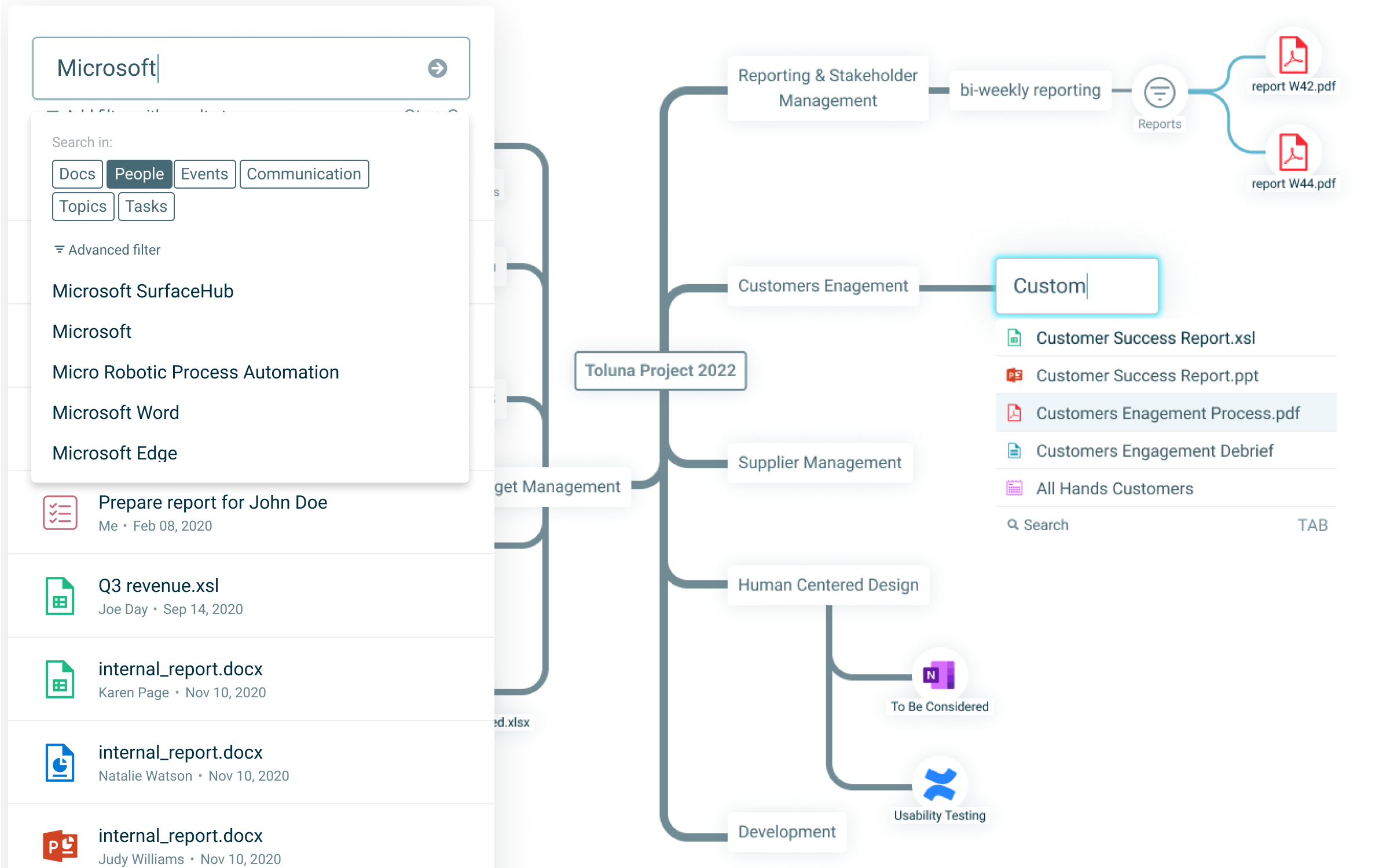
Navigational Network (Graph)
The core canvas for exploring connected items. Pan, zoom, and focus reveal relationships across projects, people, files, and links.
Build the Network
The core navigation strategy represents each piece of information (document, email, task, contact, etc.) as a node on a map. Users build their own knowledge network by adding nodes and creating meaningful connections between related items. This network becomes a visual representation of how information relates across the organisation, allowing users to navigate through connections rather than traditional folder hierarchies. Users can collect items into personal or team views without moving them from their original sources.
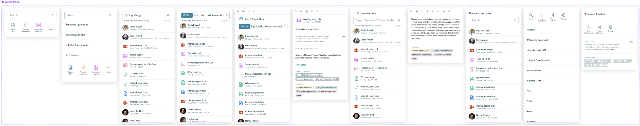
Semantic search and Active Filters
Type to surface relevant entities and relationships. Semantic search highlights meaning, not only string matches, to accelerate discovery. Active filters appear as nodes on the map that automatically generate and connect other nodes. Unlike manual connections, when a user sets a filter (e.g., "reports from 2025"), any new matching content created anywhere in the organisation automatically appears as connected nodes — keeping views current without manual updates.
UI Library Refresh
Spacing and rhythm were updated to read cleaner at a glance, while preserving density for expert users. Components were untangled, names aligned, and states unified to improve reuse and speed.
Extended Atomic Design
I extended the traditional atomic design system with an additional foundational layer:
Quarks — The foundational building blocks
Grid scales, colour styles, text styles, and icons that form the basic visual language
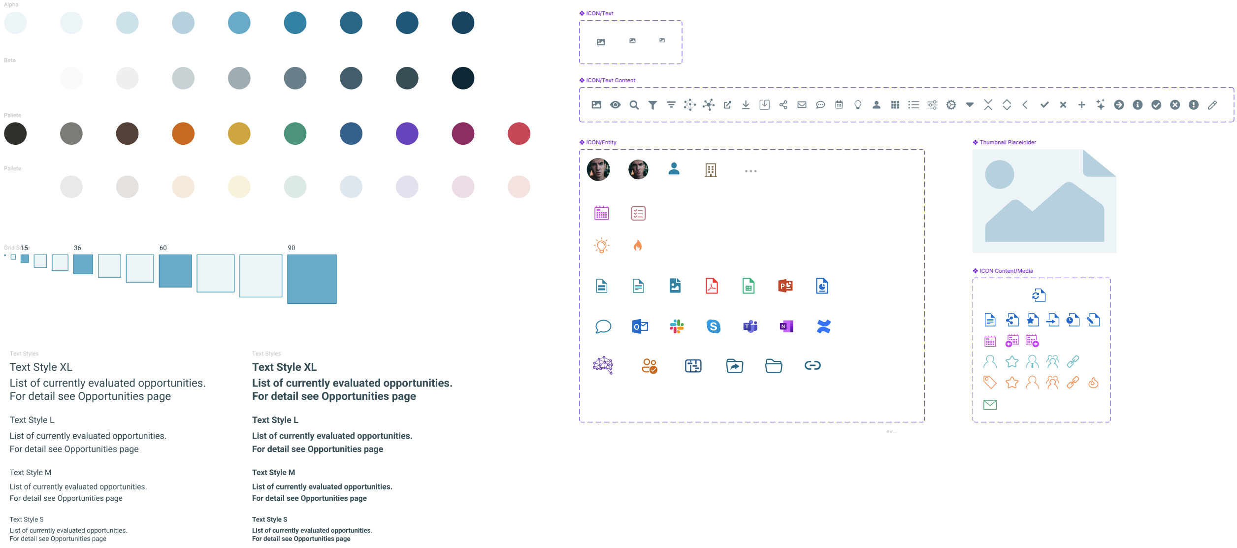
Atoms — Basic UI elements
Buttons, inputs, text fields, and frames built from quarks
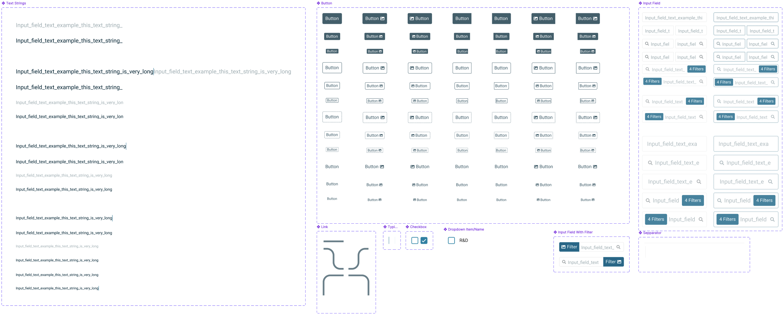
Molecules — Simple components
Combinations of atoms working together as functional units
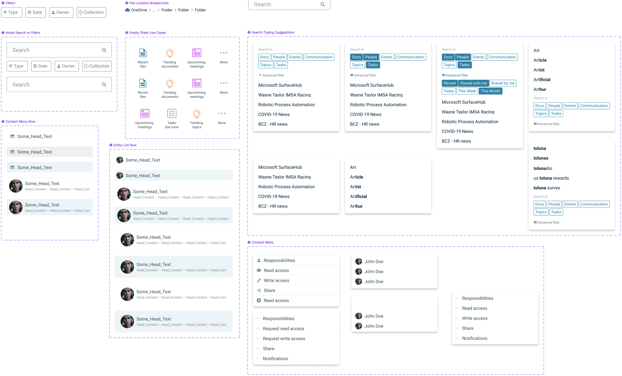
Cells — Rich composites
More complex components made of multiple molecules working together
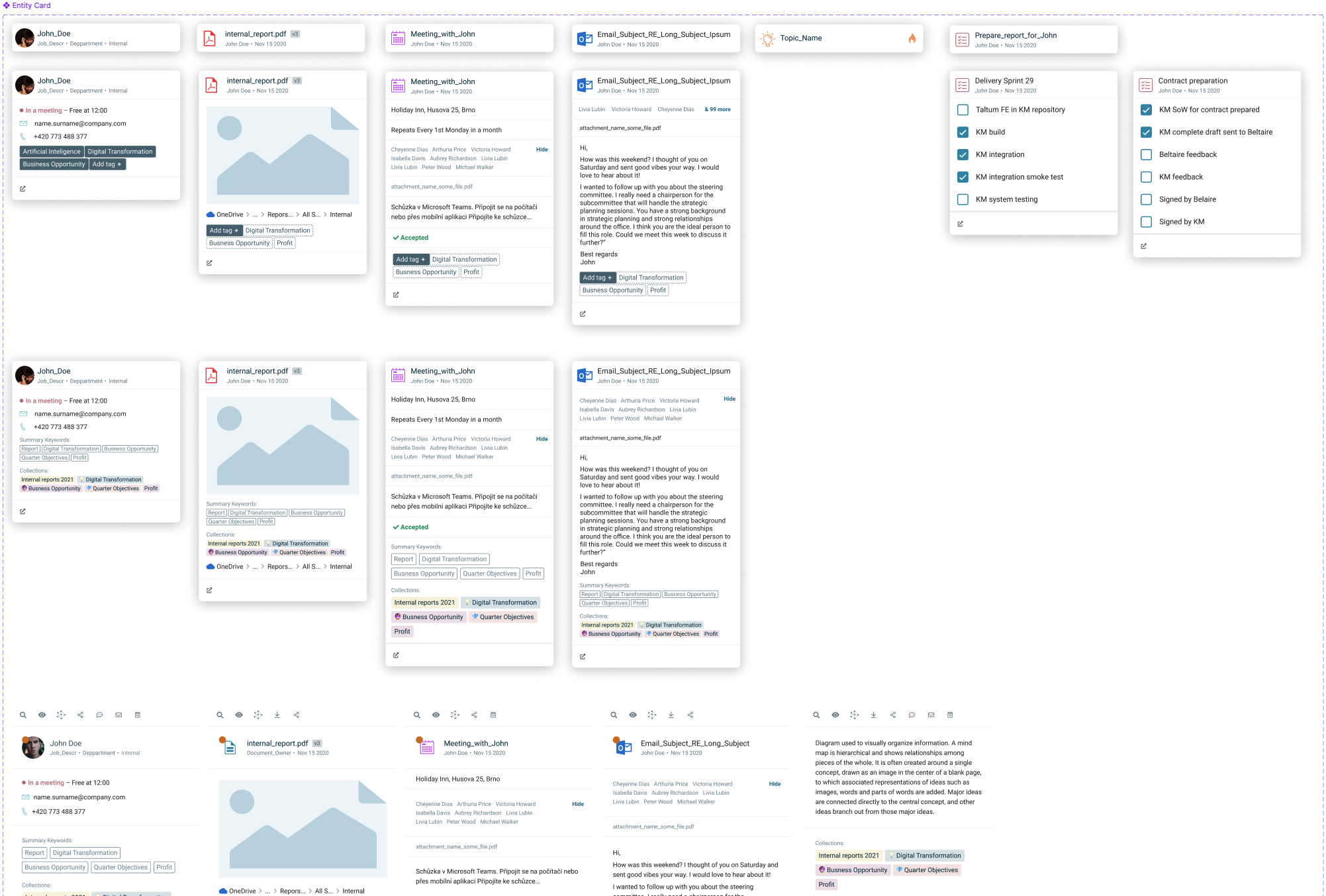
Organisms — Full sections or complex components
Complete sections with multiple states that can transform at page-level
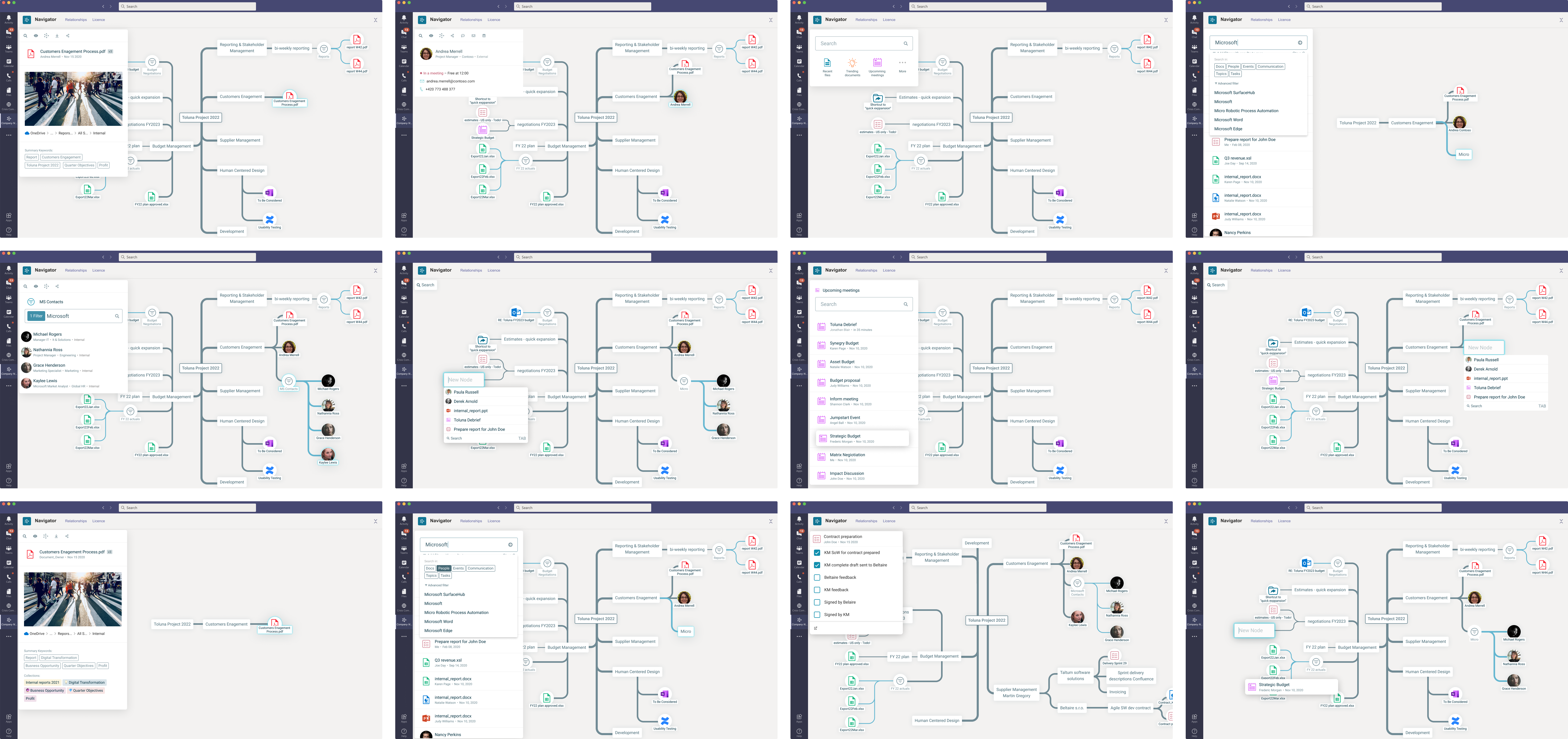
Prototyping for Validation
High‑fidelity prototypes recreated real interactions so testers could feel the product. This was essential because the concepts and interaction patterns were new and needed believable motion and feedback.
Scale of Work
Designed ~14 feature areas with ~6–10 iterations each, producing on the order of 100–200 screens.
Outcome
A tighter, clearer UI library and validated interaction patterns that made complex information feel navigable, fast, and actionable.